This is where you customise how your chatbot looks on your website: the icon, your brand colours, the window size and the text your visitors see. Everything updates on your widget without touching a line of code.
Icons
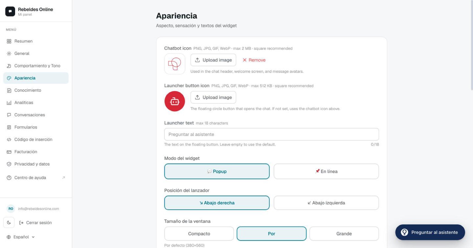
Chatbot icon
This is the image shown in the chat header and as the bot's avatar. Recommendations:
- Square 1:1 format, minimum 256×256 px (512×512 is ideal).
- Transparent PNG, or one with your background colour.
- Maximum 2 MB.
If you don't upload an icon, a generic robot is shown in your brand colour.
Launcher icon
The launcher is the floating circular button visitors see when the chat is closed. By default it uses the same icon as the chatbot, but you can set a different one.
- 512 KB image limit.
- Launcher text: up to 18 characters.
- The launcher colour adapts automatically to your brand colour.
Widget mode
If you choose Inline, remember to set up the container on your site. You'll find the details in install the widget on your website.
Position and size
- Launcher position (popup mode only): bottom-right (default) or bottom-left.
- Window size:
On mobile, the window always opens full-screen, regardless of the size you choose.
Colours
- Primary colour — your brand colour. Applied to the launcher, the header, buttons and the visitor's chat bubbles.
- Bot bubble colour — the background of the chatbot's messages.
Text adapts automatically to light or dark depending on the background colour, so you don't have to worry about contrast.
Text
- Header subtitle — for example, "Usually replies in 2 minutes".
- Input placeholder — the grey text inside the message box.
Extra options
- Show bot avatar — turn the avatar next to messages on or off.
- Auto-open — opens the chat automatically. Configured separately for desktop and mobile. Use it carefully on mobile: it can feel intrusive.
- Form notification email — where new-lead alerts are sent. You can add several, separated by
;. More on this in forms. - Time zone — so timestamps match your business.
- Suggested questions — up to 4 starter buttons to guide the visitor.
Preview
- On the Pro plan you get a live preview while you edit.
- On any plan, the "Try it" button in the Overview opens your chatbot in a new tab so you can see it exactly as a visitor will.
Want it pixel-perfect?
If you're unsure about icons, colours or sizing, open the ChatME Assistant in the dashboard and it'll guide you on the spot. And if you'd rather review it together, book a demo.
Ask the ChatME Assistant
It's in your dashboard and knows every step. Or book a demo and we'll set it up with you.
Start free